Real-time analytics allow businesses to quickly detect and address issues as they arise. It empowers your IT and network teams with faster decision-making capabilities and affords your business greater operational agility. In this article, we’ll show you how to monitor key performance metrics of your live events in real time using our advanced analytics platforms, Kollective IQ and Kollective Free Analytics.
This is our second article in a series of posts on real-time analytics. If you haven’t read the first article, explore How Real-Time Analytics Benefit Your Communications Strategy here.
Monitor Stream Quality in Real Time
Kollective IQ and Kollective Free Analytics provide several ways to track the stream quality of your event in real time. In the analytics dashboards, stream quality is represented by QoE (Quality of Experience). Start with the “Reach by QoE” tile in the views and experience dashboard. The donut chart displays the percentage of viewers experiencing each level of QoE, from excellent to bad.
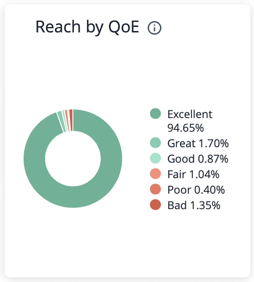
In the example above, we notice that 1.35% of our audience has experienced bad streaming quality at some point in this event. Rather than waiting for our event to end, we can explore this data while our event is still in progress. Simply click on the section of the Reach by QoE chart you want to examine to bring up detailed statistics broken down by user. Clicking on the “bad” section of the chart reveals new data fields to help you diagnose potential issues (see below).
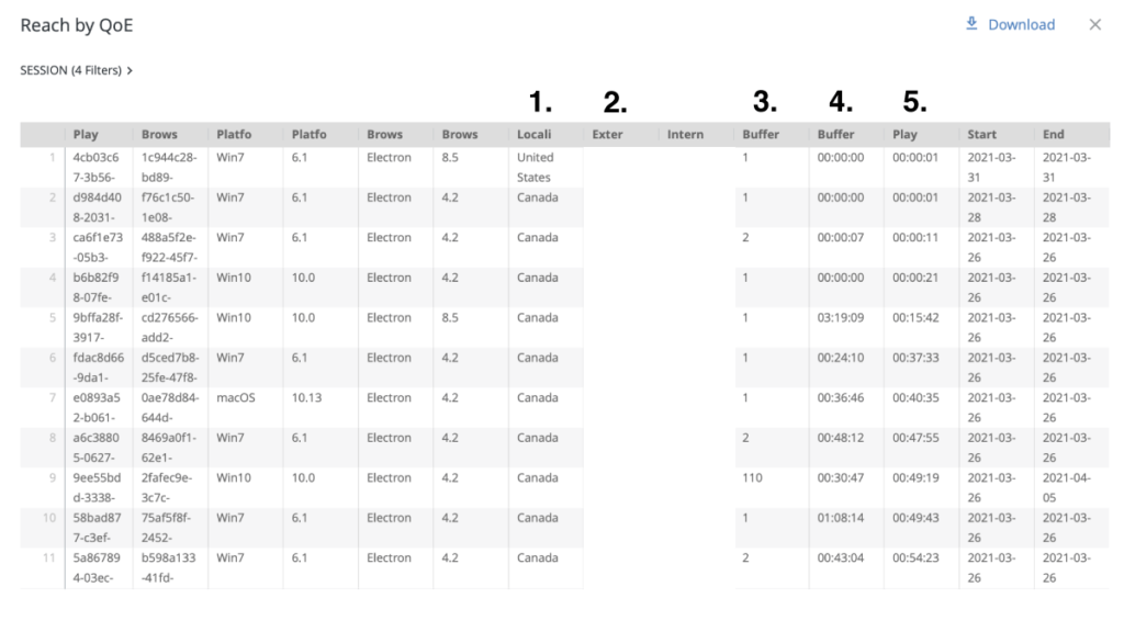
While there are many columns in this report, highlighted are five of the most useful:
- Locality - The viewer’s country
- External IP - The viewer’s external IP address
- Number of Buffering Events - The number of separate buffering instances the viewer experienced
- Total Buffering Time - The amount of time spent buffering during playback
- Total Playback Time - The amount of playback time without buffering
Reviewing the detailed statistics on “bad” QoE scores reveals a series of users experiencing varying degrees of buffering. Some users are experiencing lengthy buffering delays, while it appears others abandoned the stream early perhaps in response to buffering problems. Looking at the most severe cases, we notice that most of these users are located in Canada and share the same external IP address (note: IP addresses have been obscured for privacy purposes).
In a few quick steps, we’ve determined that employees at a Canadian office are having buffering problems. Armed with this information, we can contact IT at this office to resolve the issue while our event is still running. We can also send the event as video on demand (VOD) to all employees at that location as soon as the event ends to ensure essential messaging isn’t missed.
Identify Buffering by Location in Real Time
The delivery and consumption dashboard in Kollective IQ and Kollective Free Analytics provides another method for monitoring stream quality in real time. In the previous example, you learned how to analyze groups of viewers that experienced the same QoE and identify potential geographic trends. In this example, we’ll start with geography and show how to quickly and easily detect issues.
Before diving into the example, let’s review the delivery and consumption dashboard. The primary areas of concern for this dashboard are the delivery map on the left and the four bar graphs on the right. The map contains a series of circles that represent event viewership for a given location (larger circles equal areas of greater viewership). The bar graphs list the top ten areas of viewership broken down by: external IP, locality, country, and city. Each field on the bar graphs has a corresponding QoE dot that represents the average streaming quality for that location.
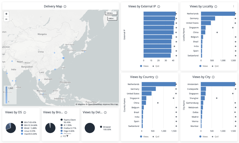
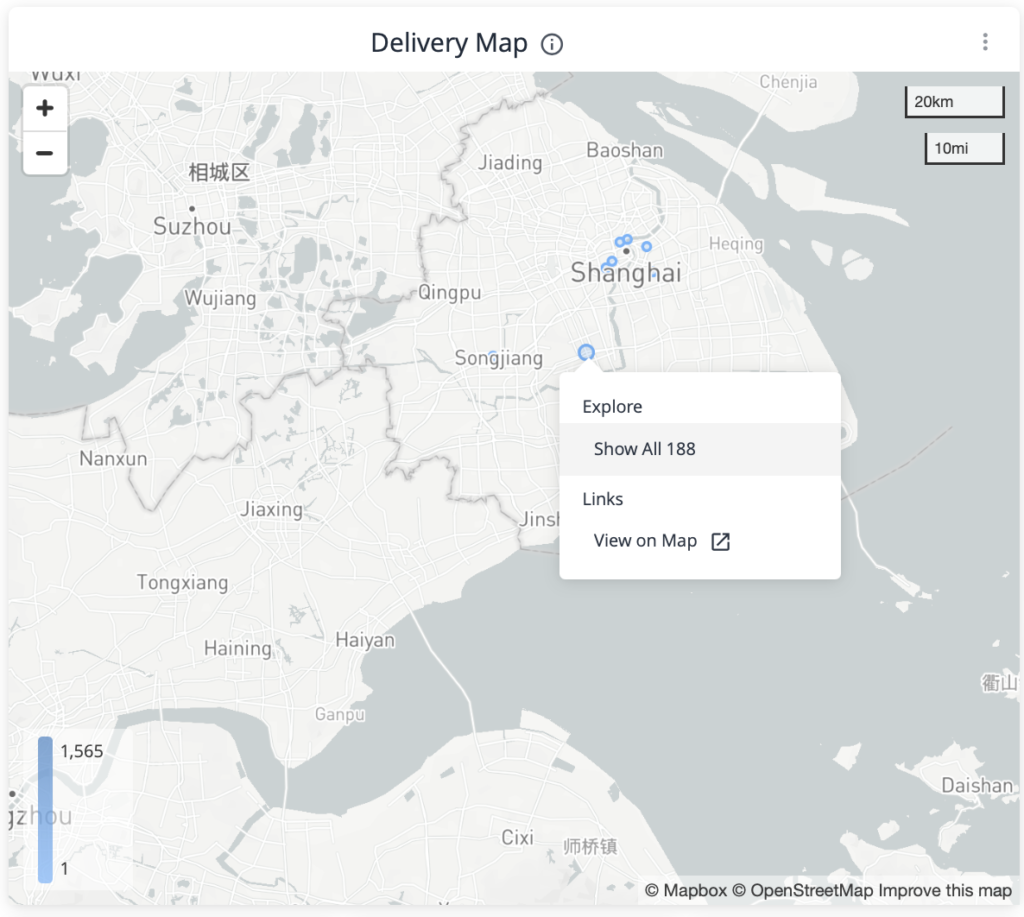
Starting with a high-level overview, we see that all countries listed in the top ten have good QoE scores except China. Notice in the Views by City graph that the Shanghai office is performing poorly. Click on the Shanghai bar graph to explore this data or zoom into the delivery map to select the Shanghai office, excluding any nearby remote viewers.
Since these graphs provide a quick QoE reference for the ten locations with the highest event viewership, it’s often the fastest way to detect buffering and stream quality issues for events in which ten or less offices are participating. However, with events streaming to more than ten locations it’s best to use this dashboard in conjunction with the “Reach by QoE” tile discussed in the first example of this article.
Track Microsoft 365 Video Performance in Real Time
Are you using Microsoft Teams or Stream to deliver live and on-demand video? Gain real-time insights into event performance and employee behaviors with Kollective Free Analytics today.